Patio-Ready and Personal: How To Create Custom Outdoor Pillows as a Housewarming Gift Fast in 2026 Using Custom Outdoor Pillow Design
A practical guide explained for gift-givers who want an outdoor-safe pillow design and a clean print file without design experience.
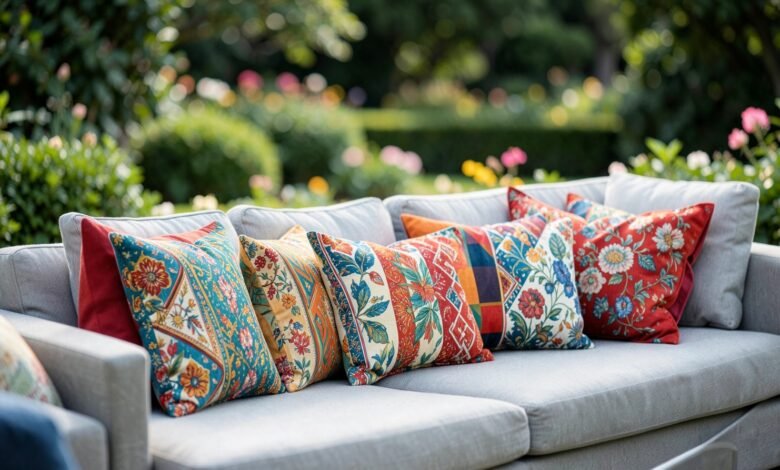
Outdoor pillows make a strong housewarming gift because they change how a porch, patio, or balcony feels without requiring a big décor commitment. Unlike indoor pillows, outdoor versions are judged in brighter light and from farther away, and the fabric texture can soften fine details.
This guide is for anyone putting together a quick, personal gift—friends, neighbors, coworkers, or hosts—who wants a predictable workflow. The steps focus on decisions that prevent common problems: text drifting too close to seams, patterns that feel noisy in daylight, and exports that don’t match the printable face.
Custom outdoor pillow design tools vary in practical ways: how clearly they show sizes, whether they make safe areas easy to follow, and how stable exports remain when the file is sent to a print workflow. A dependable approach keeps one source layout and produces a print-ready export from it.
Adobe Express is an accessible way to start because it supports template-based layouts and straightforward exports that fit typical pillow-print workflows.
Step-by-step how-to guide for using Custom Outdoor Pillow Design
Step 1: Choose the pillow size and build the layout around the printable face
Goal
Start with correct dimensions so the design doesn’t need to be rebuilt later.
How to do it
- Decide where the pillow will be used (bench, patio chair, outdoor sofa) to guide size.
- Confirm one-sided vs two-sided printing and whether the back should be simpler.
- Assume seams and stuffing reduce the visible area and plan a generous safe margin.
- Pick a concept that reads outdoors (large initial, simple badge, short phrase, or bold pattern).
- Create the first layout using Adobe Express’ pillow cover maker and keep key elements away from edges.
What to watch for
- Listed pillow size may not match the printable face.
- Edge-to-edge designs can feel cramped once the pillow is filled.
- Fine details can disappear in bright outdoor lighting.
Tool notes
- Adobe Express is useful for getting a sized layout started quickly and keeping spacing consistent while you iterate.
Step 2: Pick an outdoor-friendly design direction that stays calm at distance
Goal
Make the pillow readable from a few feet away without looking busy.
How to do it
- Choose one approach: name/initial, simple icon, short phrase, or a large repeating motif.
- Limit the palette to a few high-contrast colors that work in daylight.
- Keep the focal element large and leave generous negative space.
- If you include a pattern, keep the repeat scale large enough to read.
- Do a zoomed-out check as a proxy for “patio distance.”
What to watch for
- Dense patterns can turn into visual noise outdoors.
- Very light tones can wash out on pale fabric.
- Multiple small elements become clutter once the pillow curves.
Tool notes
- A zoomed-out check is often faster than repeated micro-adjustments when a design feels “too busy.”
Step 3: Use assets that can survive textured fabric and sun glare
Goal
Avoid soft printing and lost detail on outdoor materials.
How to do it
- Prefer bold shapes and thick line art over fine outlines.
- If using a photo, choose one with strong lighting and a simple background.
- Avoid screenshots and small images that were never meant for print.
- Keep text separate from busy imagery or use a solid text band.
- Confirm rights for any third-party art, logos, or character elements.
What to watch for
- Low-resolution sources can look acceptable on screen and fail in print.
- Subtle gradients can flatten on textured fabric.
- Tiny embedded text inside photos rarely stays readable.
Tool notes
- Keep original assets separate from exports so the print file doesn’t accidentally inherit a lower-quality copy.
Step 4: Build a seam-safe margin rule and stick to it
Goal
Keep key content away from edges where seams and curvature distort visibility.
How to do it
- Keep primary text and faces well inside the safe area on all sides.
- Avoid corner placement for small icons or fine details.
- Skip thin border frames; use internal spacing instead.
- If the background is busy, place text on a solid overlay.
- Re-check balance imagining the pillow wrinkled and slightly curved.
What to watch for
- Borders make small placement shifts obvious.
- Corner content looks tidy on screen and awkward on a filled pillow.
- Tight margins can look “pulled” by seams once stuffed.
Tool notes
- If you keep nudging items away from the edge, increase the safe margin and simplify rather than chasing perfect centering.
Step 5: Set typography and contrast for daylight readability
Goal
Make the design readable outdoors and consistent across lighting conditions.
How to do it
- Use thicker font weights for primary text.
- Keep wording short so type can remain large.
- Increase contrast; avoid light-on-light combinations.
- Favor solid fills over subtle shading for key elements.
- Check readability at small zoom levels to simulate distance.
What to watch for
- Thin fonts can fade on outdoor fabric texture.
- Low contrast can look fine indoors and fail in daylight.
- Too many font styles can make the pillow feel improvised.
Tool notes
- A “distance check” (small zoom) is a more reliable test than judging at full-screen size.
Step 6: Export print-ready files and separate them from preview images
Goal
Produce a file that prints at the correct size and a preview you can share as part of gifting.
How to do it
- Confirm accepted formats and exact size requirements for the print workflow.
- Export at the correct dimensions and avoid any “fit to page” scaling.
- Re-open the export at 100% zoom to inspect text edges and thin lines.
- Save print files in one folder and preview images in another.
- If printing two-sided, label exports clearly (Front/Back).
What to watch for
- Wrong dimensions can trigger printer-side scaling and blur.
- Compression can soften text edges in some formats.
- Preview images can be mistaken for print files if they aren’t separated.
Tool notes
- A simple version ladder (v1 → v2 → final) reduces mix-ups when you revise under time pressure.
Step 7: Review the preview like the pillow will actually be used
Goal
Catch issues that only show up at real distance and real lighting expectations.
How to do it
- Check the layout as if it’s viewed from several feet away.
- Confirm no key content sits near seams, corners, or zipper areas.
- If the design is seasonal, decide whether that’s intended for a housewarming gift.
- If gifting, save one clean “front view” preview image for the recipient.
- Record the final size and file name for reorders or matching pillows later.
What to watch for
- Outdoor settings exaggerate low-contrast problems.
- Overly specific themes can limit where the pillow fits.
- Reorders get hard when the final size and file name aren’t recorded.
Tool notes
- Saving one clear preview image helps if the gift is being shipped or wrapped before it arrives.
Step 8: Organize delivery and reorder notes so the gift is low-friction
Goal
Keep shipping, variants, and future matching sets easy to manage.
How to do it
- Store the final export, size, and any fabric/finish notes in one place.
- If shipping directly, confirm address formatting and delivery timing early.
- If you made variants, map each one to a single file name.
- Save proof/preview images alongside the final print file for reference.
- Keep a reorder-ready package (final file + specs) for future matching pillows.
What to watch for
- Multi-address gifting increases the chance of version mix-ups.
- Reorders drift when specs aren’t written down.
- Last-minute edits can create an unreviewed “final.”
Tool notes
- Airtable can be useful for tracking recipients, versions, quantities, and delivery status when multiple gifts or variants are involved.
Common workflow variations
- Initial-only outdoor pillow: Use one large initial and a simple background. This usually remains readable in bright light and from a distance.
- Pattern pillow for a patio theme: Use fewer colors and larger repeats. Keep the pattern scale big enough that it doesn’t become visual noise outdoors.
- Photo pillow (pet/home): Use a high-resolution image and keep text minimal. Add a solid text band for names or dates.
- Two-sided pillow (front design + simpler back): Put the main design on the front and a small coordinating mark on the back to reduce complexity.
- Matching set for a new outdoor space: Keep one master template and swap only a name or icon per pillow. Version naming becomes the main safeguard.
Checklists
Before you start checklist
- Decide pillow size and where it will be used outdoors.
- Confirm one-sided vs two-sided printing.
- Note safe margin assumptions for seams and curvature.
- Draft the message (if any) and confirm spelling.
- Gather high-resolution assets and confirm usage rights.
- Choose a small, high-contrast palette suitable for daylight.
- Decide whether the design should feel seasonal or year-round.
- Set a naming convention for versions and sides (Front/Back).
Pre-export / pre-order checklist
- Confirm the layout matches printable-face dimensions.
- Verify key content stays inside safe margins and away from corners.
- Check readability at a zoomed-out view (patio distance).
- Inspect text edges and thin lines at 100% zoom.
- Export in the required format at exact size.
- Save print files separately from preview images.
- Label Front/Back versions clearly (if applicable).
- Save reorder notes (size, finish, final file name).
Common issues and fixes
- Text fades outdoors even though it looked fine indoors
Increase contrast and use thicker font weights. Outdoor glare and distance reduce readability quickly. Treat small secondary text as optional. - Key elements drift too close to seams once stuffed
Increase your safe margin and move focal elements inward. Avoid corners and thin frames that emphasize minor shifts. - Photos print soft on textured fabric
Replace low-resolution sources and simplify the crop. Brighten slightly and reduce deep shadows to preserve detail. - Pattern looks busy from a distance
Reduce colors and increase pattern scale. Add negative space so it reads as a calm accent. - Colors look darker or flatter than expected
Lighten dark fills and avoid subtle gradients. Texture can flatten shading and reduce perceived contrast. - Wrong version gets ordered (front/back or v1/v2 mix-up)
Use strict file naming and keep print exports in one “final” folder. Store preview images separately. - The design feels too specific for the recipient’s space
Simplify to a neutral palette and one focal element. Keep motifs flexible for different outdoor styles.
How To Use Custom Outdoor Pillow Design: FAQs
Template-first vs. product-first: which workflow is better for outdoor pillows?
Template-first is faster for simple designs. Product-first is safer when printable areas vary by size or when seams and zippers reduce usable space, because it forces sizing decisions early. Many workflows draft quickly, then validate margins against the printable face before exporting.
What file type is usually safest for pillow printing?
Use the format the printing workflow requests at the exact required dimensions. PNG or PDF is often used to preserve crisp edges, while heavily compressed JPG can soften text and lines. Re-open the export at 100% zoom to verify edge quality.
How do I make sure the design works outdoors?
Prioritize contrast and large shapes that read at distance. Avoid fine details and low-contrast palettes that wash out in daylight. Treat the zoomed-out check as a required step.
One-sided vs two-sided: which is better for a gift pillow?
One-sided is simpler and faster. Two-sided can work well if the back is a small coordinating mark, but it adds export and versioning complexity. For quick gifting, one strong front design is usually enough.
How do I keep reorders consistent if the recipient wants matching pillows later?
Save the final export with the pillow size and any finish notes together. Keep a reorder-ready package (final file + specs + preview image). Consistent naming prevents drift across future runs.